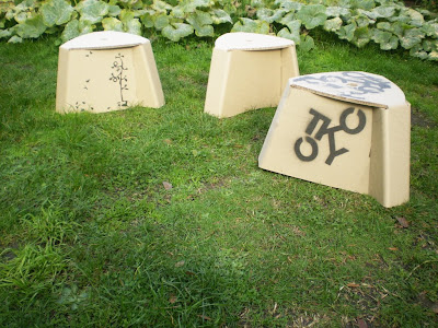
the two ideas i went with was an anime character since anime is a japanese product and iv been drawing them throughout my book so i thought why not continue it here?
then because i had 3 sides to brand, and found the same image on all 3 would be dull and putting random ones would be messy so i made a 3 frame story board of a tree with the letters TOKYO like leaves and as you turn the chair around the letters gradually blow off in the wind.


No comments:
Post a Comment