http://www.youtube.com/watch?v=_0PZ5ctE8hw
of me assembling it.
Thursday, June 4, 2009
Prying open my 3RDYE.
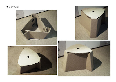
At last my final model. It's small, it's light, it takes just under 40seconds to put together (after a little practice) and you get two patterns out of one 1830x1220 sheet! talk about economical (see below). Key features includes: uhm.. it has a hole in the center to carry it with and uh.. it looks cute? anyway, after thinking long and hard i decided to call it the 3RDYE Chair after the song Third Eye by the band Tool. they were pretty much my soundtrack to this subject so i thought it'd be a nice piece of trivia for the kids :D
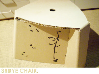 Dimensions:
Height - 298mm
Width at base - 455mm
Width at seat - 390
Thickness - 10mm
 Dimensions:
Height - 298mm
Width at base - 455mm
Width at seat - 390
Thickness - 10mm
Brand New.
And here we have the context.. of the thing...
Right so please excuse the scenes my chair was shopped into. that Carpet of green stuff was the closest photo of the event i could get that had grassy stuff in it. Im having internet issues and virus problems which screwed up my search. trust me, i was very pissed off.
Anyway, it's a picnic chair. i envisioned in on a grassy outdoor area, such as my backyard (minus the pumpkin patch) it's low and stable so you can lean in any direction to drop crumbs or what have you if you aren't granted the luxury of a serviet like my mum has.
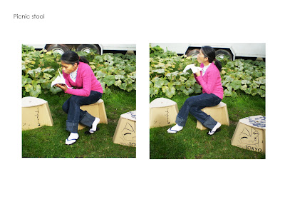
Anyway, it's a picnic chair. i envisioned in on a grassy outdoor area, such as my backyard (minus the pumpkin patch) it's low and stable so you can lean in any direction to drop crumbs or what have you if you aren't granted the luxury of a serviet like my mum has.

I'll take the risk.
Okay, about the graphics...
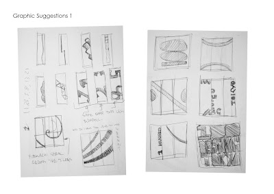
I knew all we needed to do was splash the event logo over it but i kinda wanted to do something original, clever and creative. as i understood it, we could brand anything we want as long it had relevance. and so because having the curvature in the sides didn't work i figured id use the space for the branding.
the two ideas i went with was an anime character since anime is a japanese product and iv been drawing them throughout my book so i thought why not continue it here?
then because i had 3 sides to brand, and found the same image on all 3 would be dull and putting random ones would be messy so i made a 3 frame story board of a tree with the letters TOKYO like leaves and as you turn the chair around the letters gradually blow off in the wind.
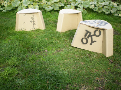

I like stencil art.
And so the theory was to cut out some stencil graphics then spray paint them.. this idea was good, in theory! in theory communisim works! in theory! uh- well the idea didnt give me a clean enough finish soooo...
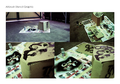
I decided to just use a black marker. it was alot easier i tell you. i liked the grungy grafetti look of the paint tho.. but it wasnt what i was after.
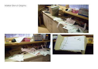

I decided to just use a black marker. it was alot easier i tell you. i liked the grungy grafetti look of the paint tho.. but it wasnt what i was after.

Vampirism?
And thus! The creature shows itself!
After carefully assessing the issues of trials one and two i forked this mofo out. it's evidently the first attempt but without the arches in the bottom. i used a drill bit and turned it by hand to make the hole. carefully, coz thats what wrecked the second attempt. as well as some shoddy cutting abilities.

Xanita Trialing
So here i'm trialling my design out of xanita. i had an A0 pattern printed to use as a stencil but the proportion came out wrong so i had to draw one up myself.. lucky its a rotational pattern so i only made one stencil for and traced that serveral times.
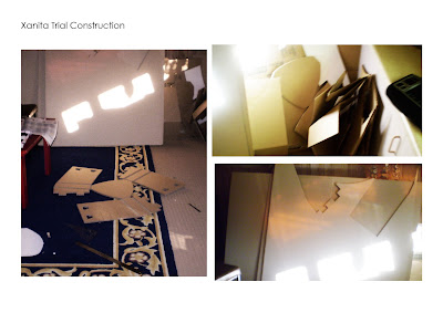
Here's the outcome of the trial.. it actually worked reaaallyy well, and i got my dad to stand on it to prove its strenght. i totally could have used this as my as my final piece however... i decided to put those arc cuts in the bottom and they looked like crrap! so later that night i made a 2nd one which i also ruined so lucky i had a spare sheet to make a 3rd.
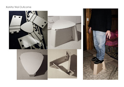

Here's the outcome of the trial.. it actually worked reaaallyy well, and i got my dad to stand on it to prove its strenght. i totally could have used this as my as my final piece however... i decided to put those arc cuts in the bottom and they looked like crrap! so later that night i made a 2nd one which i also ruined so lucky i had a spare sheet to make a 3rd.

Tuesday, May 26, 2009
Note to self.
Pretty much how i plan to follow through with making the final final thing.
- pick up xanita sheets. oh! bring 50 bucks. - tomorrow.
- make a template in solidworks/ stencil for graphics - tomorrow night.
- print out template/ stencil and cut out - thursday arvo.
- trace pattern on xanita and start carving it up - thursday night
- finish carving and fold it all together - friday morning
- random drive and maccas - friday arvo.
- paint on graphics - saturday.
- leaving 6 days to tweak and remake if something stuffs up.
cool.
gfx to go.
Right so i wasn't sure what to go with graphics wise.. kinda wanted something simple and easy to apply since i'm planing to spray paint and stencil. decided i'd only apply it to the drafted leg faces and kinda wanted to do something cleaver or have meaning/ relevance to the subject/ event. stuff like geometric shapes, spirals, fibonachi yadayada and heck even some chibi and a handgrenade coz why not. probs won't follow through with that tho ha and my final will be totally different to any of these. i'll post 'em up later k.

Lock me up.
Nothing compares 2 U
Flat lantern and internationals!
1:1 Mecha Mock-Up v2
Tuesday, May 12, 2009
Moss makes a cuter model than me.
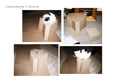
Constructed the following morning.. the finished model pictures my cat Mossy posing like a pro while i take flash photography. Actually on completion i felt it seemed a bit bigger than what i imagined... so i think might need to scale it down? and possibly somehow flatpack it for carry since it seems a bit awkward. however it is strong since it can actually support my weight making me confident about using xanita board but i was reluctant to let anyone heavier than me test it before class.

Cutting out a costume
Construction of my 1:1 model began on saturday night around 10pm where after drawing up a flat pattern in solidworks.. (which i should actually include here somewhere.. oh well next time) uh i grabbed the 3 biggest boxes i could find at hawthorn bunnings which just fit into my car dangerously blocking my blindspots while i drove home.. i ruled it up and cut it into 4 pieces which i would then tab the legs together then tape the seat onto it as there wasn't enough card to make it out of one piece.


Ride the spiral to the end..
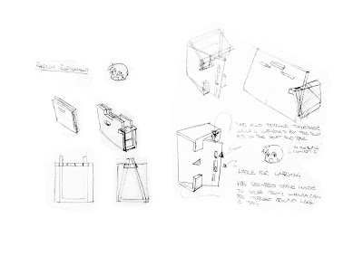
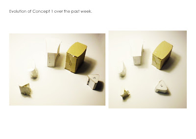
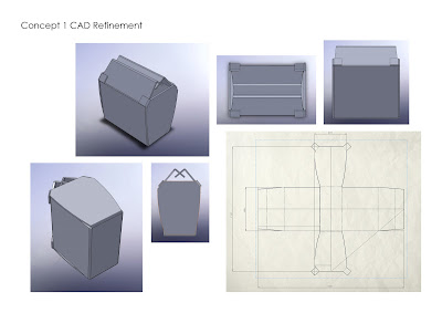
These are the models progressing in the development of concept 1 (clockwise).... it's gone through quite a bit of change and the end result thus far seems rather different in the way it comes together and it's overall form. i reverted back to the triangle base like in it's first redesign.. i ended up abandoning the bag aspect because i just kept hitting deadends and it was really doing my head in.

sfx: Shhing!
yess well while things were looking grim on friday, saturday morning seemed to be a good day. trying to make it easier on myself i shortend the constraints on my chair to just something portable. i.e. a small chair with a handle in it. i was epicly failing at attempting a bag appearance since to me everything seemed either done or just too similar to other people's ideas for my liking. so i randomly combined the few deliverables we had to try and achieve and came up with this idea. it has a clean and hidden locking system, looks (moderately) interesting for all angles with drafting and curvature, makes effiecient use of the sheet (which this actually doesn't really =/ ) uh and it needed to be portable (which it is but it doesn't exactly flatpack..) but nevertheless! it's an idea and it's best i can come up with so far *sigh*


Listen to B Talent.
Yes well i was having a particularly hard time improving my concept since everything i could think of was rubbish. trying to keep them from being '2 Dimensional' is a lot tougher than it sounds. i sorta wanted to avoid using crazy triangluation coz the idea somewhat scared me ha i don't know, but i was keen on curvature at least that felt approachable so i tried to intergrate some of that action into anything i could think of...
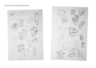 evidently as the hours ticked by i managed to fork out a bunch of scribblerish (scribble + gibberish. yes i can make up words too xD) so i gave up for the day and did other work.
 evidently as the hours ticked by i managed to fork out a bunch of scribblerish (scribble + gibberish. yes i can make up words too xD) so i gave up for the day and did other work.
Here today but we'll get there tomorrow.
Ok well i didn't complete this model 100% because i didn't think it was necessary to put in the slots and handles because frankly i didn't really like it ha. i tried to follow through with the whole "bag/seat" deal but that didn't blow over too well. it looks like a toolbox hmm... anyway it's the one i took to refine even further soo..... yeah.

Where is the line??
Tuesday, May 5, 2009
1:5 Scale Concept 1
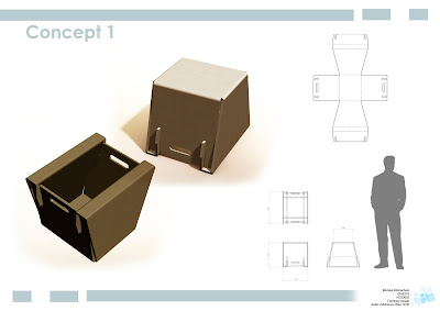
The further refined carry bag/seat sports a more tidy appearance than its predecessors. Connected together with a series of slotting tabs which hide neatly inside the body. Designed for those who need not to find an empty chair as they will always have one there in their hands! After finishing the scale model i found the sides aka the seat/ base needs to be a bit more wider than the frame since at the moment it's not as strong as it needs to be. So some further tweaking of the form will have to be undertaken.
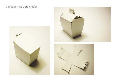 Full scale dimensions:
Seating position HxLxW: 400 x 375 x 300
 Full scale dimensions:
Seating position HxLxW: 400 x 375 x 300
1:5 Scale Concept 2
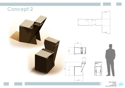
This concept was designed for a cafe/ picnicing scenario. in the refined model the main changes i made to the chair was angling the armrest over the seat a little to deter people from wanting to rest their backs against it as it is actually an armrest/ desk/ table for eating/ cup holding or talking notes on. i also added a jog to the legs for more strength and as a graphical feature. drafted and radius some of the edges for a less linear appearance as well as adding cuts to reduce material usage and weight without compromising strength.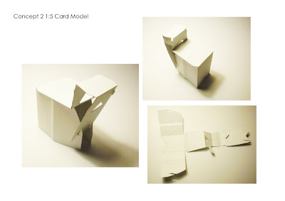
Full scale dimensions:
Seat HxLxW: 400 x 375 x 350
Desk LxW: 150 x 275

Full scale dimensions:
Seat HxLxW: 400 x 375 x 350
Desk LxW: 150 x 275
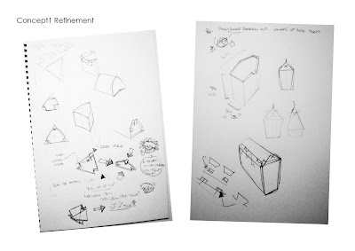
Refinement C1
Originally the crate design *shudder* ..which evolved into a rather strange bag-like design which now i've worked it into a more sensible bag-like form. is to be turned onto it's side to be sat on then when you want to move you pick it up by the handles and carry it away. can opened up and have items stowed away inside then closed back up again.

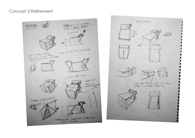
Refinement C2
I didn't want to depart from my armrest picnic chair just yet so i decided to refine it to bring it away from being too 2 dimensional without over complicating it. looking from the top and front views i tried to variate the shape a little so it doesn't just look like a rectangle from those perspectives. playing with radius' and angles i developed a few different directions i could go with.

Tuesday, April 28, 2009
New concept 1 ideation stage.
Check it.
just some random cardboard related vids on youtube i thought might be interesting to share.. good for inspiration.
http://www.youtube.com/watch?v=M_NzCgRH83k
- this seems to be some kind of prototype flexible cardboard product.. not reaallyy sure what it's for.. but it looks fun?
http://www.youtube.com/watch?v=vxD9UuiSAFo
- i'm sure a few of you might have seen this one before. it's like a desk chair folded from one huge sheet.
http://www.youtube.com/watch?v=wLp9Rf3BSZM&feature=related
- another one i'm sure a few people might have seen. made from two sheets and has a lot of triangluation folds for strenght and slotting to hold the desk against the chair.
http://www.youtube.com/watch?v=ZrbGHG8uyFU&feature=related
- am arm chair with a thick material slot fit structure. i tried to stay away from separate panal slot fits in my chairs.. i wanted to minimise the number of componants so things don't get lost or mixed up. i reckon with a coushin or two, this chair would actually be rather comfortable!
http://www.youtube.com/watch?v=cl0SD0Vr96s&feature=related
- this one is pretty cool. bit of a high chair with arm rests and no back. comes together in an interesting way using tabs. although i think the guy is using a few pins or something to hold it together at the base which would be cheating if it were our project!
http://www.youtube.com/watch?v=Oqe--zRIt24&feature=related
- a modular lounge chair! made with interlocking traingular block thingies that can be moved around to create different sitting styles. seems a bit too big to me.. and uses up alot of cardboard. interesting idea nonetheless.
http://www.youtube.com/watch?v=bx-g1jR-tsw&feature=related
- a couple of really interesting and different ideas - formwise. the triangle seat one doesn't look comfy to sit in but i'm sure a coushin will make it nicer. the rounder one actually looks rather ergonomic.. wonder how they're put together.. i saw ribs in the triangular chair underneath and up the back.
http://www.youtube.com/watch?v=NI0TsSoDtOg&NR=1
- this chair doubles as a lounge, however i think i would need to be a bit longer for it to be a suitable lounge chair. appears to be two cyclinders connected witha flat sheet.. bit like the % symbol.
http://www.youtube.com/watch?v=04UdRNHn8K8&feature=related
- this one has a few different chairs in it. the first chair looks like it has a triangular corrugation pattern as the base to hold the weight, the bench looks like it uses slotting and flolding around on itself for the legs whilst the 3rd one uses strength through curvature in the legs.
i think that's enough for now. there's definitely more which you can probs check out yourselves, but these are just a few ones i thought id comment on.
Wednesday, April 22, 2009
Concept Board 1 100%!
The first chosen concept design is for an outside eating/ picnicing scenario taking place on the lawn of the site. a short stool which allows people to lean forward while eating finger/ hand held food so not to drop crumbs all over themselves. the legs wrap around so the card skin layer acts as a wider foot base for better stability on uneven ground and less damage to the material. Also the seat can be flipped over and used to carry or store items later on if users decide to take it home with them.

Concept Board 2 100%!
The second chosen concept design is for a cafe like scenario. it sits the user at a comfortable height and has a small table good for holding things like a coffee or eating small dishes off. an extra support rib is slotted in beneath the table to keep it sturdier which can also be used to store things like magazines or promotional reading material.

Concept Board 3 100%!
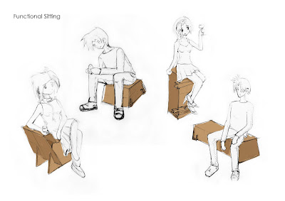
Functional Sitting 100%!
These are just a few of the postions idealised for my seat designs. trying to depict the size and posture you might come to expect from sitting on each of these different chairs as you engage with their functions and roles within the event. the 2 right figures are of the different orientaions of the bench-bar seat.

Tuesday, April 21, 2009
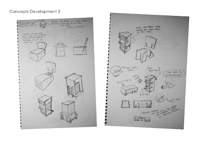
Concept 3 100%!
The 3rd concept i was a bit unsure what direction to take.. first i wanted a regular chair that you can sit and relax in then i thought about a bench then somewhere along this twisted path i thought up a bench fit for 2 people that can be oriented upright and be used as a high bar stool. from personal bar stool sitting experiences at a gig once, this particular stool had no foot rests which made it really uncomforatble for someone like me who's not a giant, to sit on. so i made sure to add some ribs in for people to rest their feet on. tada multi-function again xD

Subscribe to:
Comments (Atom)


