http://www.youtube.com/watch?v=_0PZ5ctE8hw
of me assembling it.
Thursday, June 4, 2009
Prying open my 3RDYE.
At last my final model. It's small, it's light, it takes just under 40seconds to put together (after a little practice) and you get two patterns out of one 1830x1220 sheet! talk about economical (see below). Key features includes: uhm.. it has a hole in the center to carry it with and uh.. it looks cute? anyway, after thinking long and hard i decided to call it the 3RDYE Chair after the song Third Eye by the band Tool. they were pretty much my soundtrack to this subject so i thought it'd be a nice piece of trivia for the kids :D
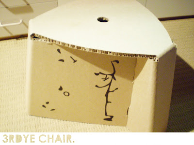 Dimensions:
Height - 298mm
Width at base - 455mm
Width at seat - 390
Thickness - 10mm
 Dimensions:
Height - 298mm
Width at base - 455mm
Width at seat - 390
Thickness - 10mm
Brand New.
And here we have the context.. of the thing...
Right so please excuse the scenes my chair was shopped into. that Carpet of green stuff was the closest photo of the event i could get that had grassy stuff in it. Im having internet issues and virus problems which screwed up my search. trust me, i was very pissed off.
Anyway, it's a picnic chair. i envisioned in on a grassy outdoor area, such as my backyard (minus the pumpkin patch) it's low and stable so you can lean in any direction to drop crumbs or what have you if you aren't granted the luxury of a serviet like my mum has.
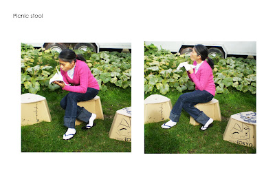
Anyway, it's a picnic chair. i envisioned in on a grassy outdoor area, such as my backyard (minus the pumpkin patch) it's low and stable so you can lean in any direction to drop crumbs or what have you if you aren't granted the luxury of a serviet like my mum has.

I'll take the risk.
Okay, about the graphics...
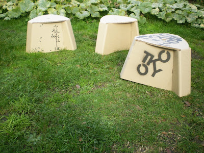
I knew all we needed to do was splash the event logo over it but i kinda wanted to do something original, clever and creative. as i understood it, we could brand anything we want as long it had relevance. and so because having the curvature in the sides didn't work i figured id use the space for the branding.
the two ideas i went with was an anime character since anime is a japanese product and iv been drawing them throughout my book so i thought why not continue it here?
then because i had 3 sides to brand, and found the same image on all 3 would be dull and putting random ones would be messy so i made a 3 frame story board of a tree with the letters TOKYO like leaves and as you turn the chair around the letters gradually blow off in the wind.

Subscribe to:
Posts (Atom)


