Tuesday, April 28, 2009
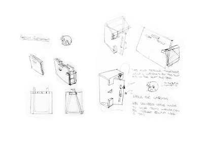
New concept 1 ideation stage.
Nothing flash, just played around with some new forms for my concept 1. the original was somewhat of a crate.. which is a pretty awful idea. what i wanted was something more like a bag so i just developed this new concept which is yet to be modelled up properly.


Check it.
just some random cardboard related vids on youtube i thought might be interesting to share.. good for inspiration.
http://www.youtube.com/watch?v=M_NzCgRH83k
- this seems to be some kind of prototype flexible cardboard product.. not reaallyy sure what it's for.. but it looks fun?
http://www.youtube.com/watch?v=vxD9UuiSAFo
- i'm sure a few of you might have seen this one before. it's like a desk chair folded from one huge sheet.
http://www.youtube.com/watch?v=wLp9Rf3BSZM&feature=related
- another one i'm sure a few people might have seen. made from two sheets and has a lot of triangluation folds for strenght and slotting to hold the desk against the chair.
http://www.youtube.com/watch?v=ZrbGHG8uyFU&feature=related
- am arm chair with a thick material slot fit structure. i tried to stay away from separate panal slot fits in my chairs.. i wanted to minimise the number of componants so things don't get lost or mixed up. i reckon with a coushin or two, this chair would actually be rather comfortable!
http://www.youtube.com/watch?v=cl0SD0Vr96s&feature=related
- this one is pretty cool. bit of a high chair with arm rests and no back. comes together in an interesting way using tabs. although i think the guy is using a few pins or something to hold it together at the base which would be cheating if it were our project!
http://www.youtube.com/watch?v=Oqe--zRIt24&feature=related
- a modular lounge chair! made with interlocking traingular block thingies that can be moved around to create different sitting styles. seems a bit too big to me.. and uses up alot of cardboard. interesting idea nonetheless.
http://www.youtube.com/watch?v=bx-g1jR-tsw&feature=related
- a couple of really interesting and different ideas - formwise. the triangle seat one doesn't look comfy to sit in but i'm sure a coushin will make it nicer. the rounder one actually looks rather ergonomic.. wonder how they're put together.. i saw ribs in the triangular chair underneath and up the back.
http://www.youtube.com/watch?v=NI0TsSoDtOg&NR=1
- this chair doubles as a lounge, however i think i would need to be a bit longer for it to be a suitable lounge chair. appears to be two cyclinders connected witha flat sheet.. bit like the % symbol.
http://www.youtube.com/watch?v=04UdRNHn8K8&feature=related
- this one has a few different chairs in it. the first chair looks like it has a triangular corrugation pattern as the base to hold the weight, the bench looks like it uses slotting and flolding around on itself for the legs whilst the 3rd one uses strength through curvature in the legs.
i think that's enough for now. there's definitely more which you can probs check out yourselves, but these are just a few ones i thought id comment on.
Wednesday, April 22, 2009
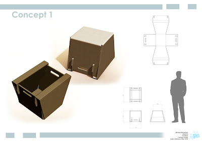
Concept Board 1 100%!
The first chosen concept design is for an outside eating/ picnicing scenario taking place on the lawn of the site. a short stool which allows people to lean forward while eating finger/ hand held food so not to drop crumbs all over themselves. the legs wrap around so the card skin layer acts as a wider foot base for better stability on uneven ground and less damage to the material. Also the seat can be flipped over and used to carry or store items later on if users decide to take it home with them.

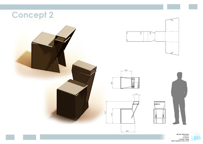
Concept Board 2 100%!
The second chosen concept design is for a cafe like scenario. it sits the user at a comfortable height and has a small table good for holding things like a coffee or eating small dishes off. an extra support rib is slotted in beneath the table to keep it sturdier which can also be used to store things like magazines or promotional reading material.

Concept Board 3 100%!
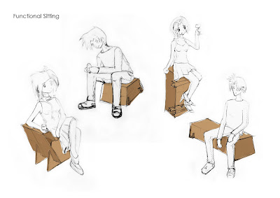
Functional Sitting 100%!
These are just a few of the postions idealised for my seat designs. trying to depict the size and posture you might come to expect from sitting on each of these different chairs as you engage with their functions and roles within the event. the 2 right figures are of the different orientaions of the bench-bar seat.

Tuesday, April 21, 2009
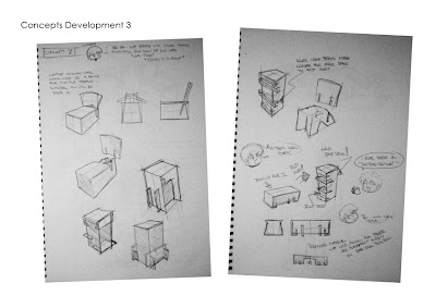
Concept 3 100%!
The 3rd concept i was a bit unsure what direction to take.. first i wanted a regular chair that you can sit and relax in then i thought about a bench then somewhere along this twisted path i thought up a bench fit for 2 people that can be oriented upright and be used as a high bar stool. from personal bar stool sitting experiences at a gig once, this particular stool had no foot rests which made it really uncomforatble for someone like me who's not a giant, to sit on. so i made sure to add some ribs in for people to rest their feet on. tada multi-function again xD

Concept 2 100%!
Concept 1 100%!
I wanted to make a low stool suitable for outside application that could be used while eating. the idea is you sit lowly on the stool about 300mm high and you spread your legs out and lean forward while you eat so any crumbs you make drop onto the ground so not having to worry about getting it on yourself which can be rather embarrassing = also because it's for outside i wanted a wide foot base for better stability. i eventually developed it into a multi-functionion seat but putting handles into it so when flipped upside down you can use it as a box to carry or store things.


Theme Board
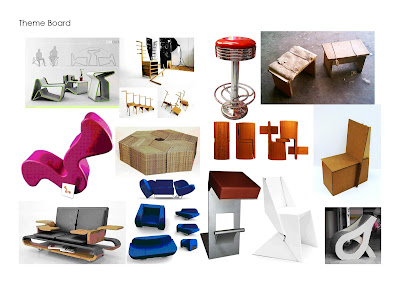
After deciding to go with 100% Design Tokyo, i wanted to establish what type of chairs and what purpose will they be filling in for the public. i know japan is a country short on space so i wanted to integrate some kind of multi-functioning into my designs. whether it be the ways you can sit in it, other positions it can reconfigure to or another task it can perform.

100% Design Tokyo: +Research & Considerations
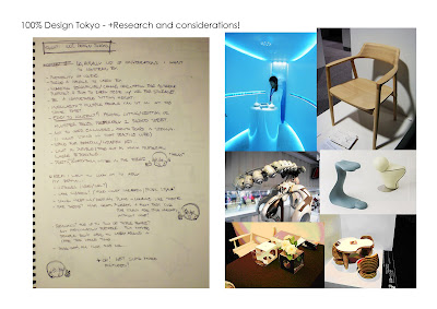
The event i decided to go with was 100% Design Tokyo. i've been interested in japanese culture for a while, and have a strong desire to travel there one day. i think it's probably from all the anime and manga i've been watching and reading.. haha. anyway, this is just some of the things i wanted to consider in my designs and also a few more shots of the event to get a better understanding of its environment.

Saturday, April 18, 2009
Tuesday, April 7, 2009
I know the pieces fit.
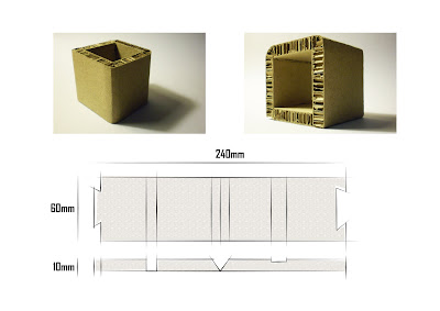
Xanita board box thingy, 10mm thick, uh... approximately 60x60x60mm. demonstrating various corner folding methods and an end joining technique. seems the radiused corner is the easiest to achieve, whilst the 45 degree corner is difficult to cut accurately and the groove corner can be confusing and doesn't take much to get wrong.

Black. and. white-are. all-i-see. in-my-in-fan-cy.
For my second attempt at ess3 i concluded my original object, the seed, was rubbish. so i tried this flower thing instead which looks to have an obvious fibonnachi sequence within it.
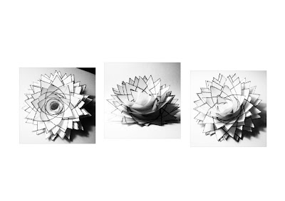 These two other models are the same flat pattern but scaled differently according to the sequence then stacked or placed upon each other to express the flowers pattern.
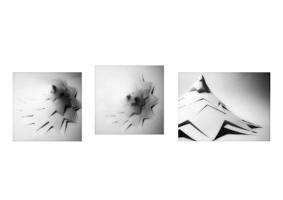
The model below is the refined version of the other 2 models. the other ones weren't getting the round ballish shape the flower had so to achieve that i made a number of the of the same flat pattern which had 16 tips and with each layer i cut out the number of the sequence then folded it around like a cone so it gradually got thinner and taller which replicates the flower petals.
 These two other models are the same flat pattern but scaled differently according to the sequence then stacked or placed upon each other to express the flowers pattern.
Subscribe to:
Comments (Atom)


